

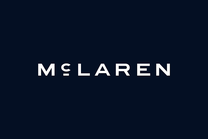
McLaren has introduced a new visual identity, giving its famous wordmark a noticeable redesign while keeping the brand’s racing heritage at the centre of the change.
Unveiled on September 22, 2026, the new identity is being introduced across McLaren Automotive and McLaren Racing. At first glance, the change may look relatively simple: the familiar McLaren lettering has been refined into a cleaner, more understated wordmark. But the story behind the redesign goes much deeper.
According to McLaren, the new wordmark takes inspiration from the sign that once stood above the family service station owned by Bruce McLaren’s parents in Remuera, Auckland, New Zealand. It was at this location that Bruce McLaren built the car that eventually took him to his first racing victory.
What Has Changed in the McLaren Logo?
The most visible change is the McLaren wordmark itself.
The new design uses a cleaner, more refined typographic treatment and introduces a distinctive horizontal line beneath the “C”. That detail is not simply a modern graphic element. It is a reference to the historic signage associated with Bruce McLaren’s family service station.
This gives the new identity a connection to McLaren’s origins rather than being a completely disconnected modern redesign.
The new wordmark is also intended to work across McLaren’s different operations, bringing McLaren Automotive and McLaren Racing under a more unified visual identity.
Why Did McLaren Change the Logo?
McLaren describes the move as an “evolved brand identity”, rather than a complete departure from its past.
That distinction matters.
The company is not abandoning the visual symbols that have become associated with McLaren. Instead, it is updating the way those elements are presented as the company enters what it describes as another chapter of growth and development.
David Woodhouse, Chief Creative Officer at McLaren Automotive, said the new identity reflects the company’s journey and future ambitions while reconnecting the brand with its origins.
The timing also comes as McLaren is expanding beyond its traditional sports-car image. The company recently announced a £500 million investment in UK manufacturing and engineering, including plans for its first SUV and additional production capacity.
That broader transformation provides useful context for understanding why McLaren is refreshing its corporate identity now.
The Hidden Story Behind the New Wordmark
The most interesting part of the redesign is perhaps not the typography itself, but where the inspiration came from.
Before McLaren became one of the world’s most recognisable names in Formula 1 and high-performance cars, Bruce McLaren’s journey began in New Zealand.
The family service station in Auckland was part of that early story. According to McLaren, Bruce built the car that would take him to his first racing victory there.
By taking inspiration from the old garage signage, the company has effectively turned a piece of its early history into a modern corporate design element.
In design terms, this approach is different from simply creating a futuristic logo. Instead of removing historical references to make a brand look newer, McLaren is using an old visual reference and adapting it for modern use.
What About the Famous McLaren Speedmark?
This is an important point for Formula 1 fans.
The Speedmark is not disappearing.
McLaren says the Speedmark remains one of its most recognisable symbols and will continue to play an important role within the brand. The company has also retained the Speedy Kiwi, which pays tribute to Bruce McLaren’s New Zealand heritage.
That means the new wordmark should not be understood as the complete replacement of every McLaren logo element.
Instead, McLaren is creating a broader visual system in which the new wordmark becomes a major part of the corporate identity while familiar symbols continue to represent the brand in appropriate areas.
McLaren’s own historical archive shows that the company’s logo has changed several times since the racing team was established in the 1960s.
Why the Design Looks More Minimal
One of the first things viewers may notice is that the new identity feels more restrained than the previous McLaren wordmark.
The lettering is cleaner and less visually heavy, while the small line beneath the “C” gives the wordmark a distinctive detail without adding unnecessary complexity.
This is where the redesign becomes interesting from a branding perspective.
A modern automotive brand has to work across many different surfaces: racing cars, road cars, clothing, digital platforms, dealerships, merchandise and social media. A simpler wordmark can be adapted more easily across these environments.
At the same time, McLaren has avoided removing all of its visual history.
The result is an identity that combines heritage references with a modern typographic system.
Why Papaya Orange Still Matters
For Formula 1 fans, McLaren is strongly associated with its famous Papaya colour.
That connection is not going away.
McLaren says Papaya remains a defining element of the brand, while the new identity introduces an expanded colour palette inspired by important moments in the company’s history.
This means the logo redesign should not be viewed as McLaren abandoning the visual identity that fans recognise from the Formula 1 grid.
Instead, the company is expanding the identity so it can represent both its racing and automotive businesses.
What Does the New Logo Mean for McLaren’s Future?
The logo itself does not change the engineering of a McLaren car or the performance of its Formula 1 team. Its significance is primarily visual and corporate.
However, the timing makes the redesign notable.
McLaren is entering a period of significant expansion, including investment in UK production and engineering and plans for a new SUV. Reuters reported that the £500 million investment is intended to expand McLaren’s manufacturing capabilities and product range.
The new visual identity therefore arrives alongside a broader period of change for the company.
The Bigger Picture
McLaren’s new logo may initially look like a small design update, but the story behind it shows that the company is trying to connect its future ambitions with the foundations laid by Bruce McLaren decades ago.
Rather than completely replacing its familiar visual language, McLaren is combining a new wordmark with established symbols such as the Speedmark, Speedy Kiwi and Papaya colour.
For fans, the most noticeable change will be the new lettering. For the company, however, the redesign represents something broader: a unified identity intended to connect McLaren Racing, McLaren Automotive, its heritage and its future direction.
The new logo is therefore less about forgetting the old McLaren and more about presenting its history in a new visual form.

