

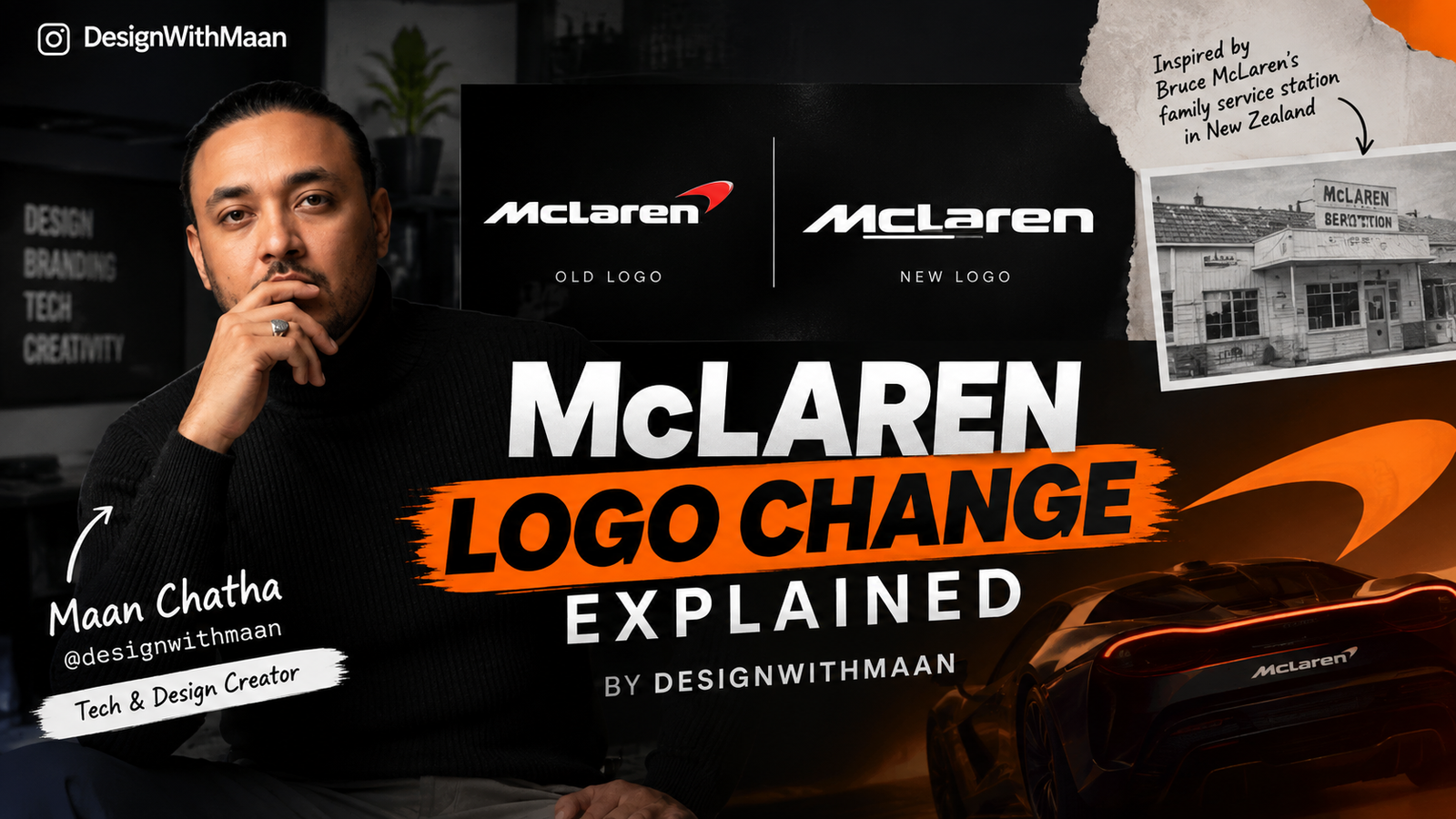
On September 22, 2026, the British automotive and motorsport brand introduced an evolved visual identity, bringing a redesigned McLaren wordmark to the centre of its branding. The change is not simply about making the logo look different. McLaren says the new identity connects its history, present-day operations and future plans across McLaren Automotive and McLaren Racing.
The redesign has also attracted attention from the technology and design community. Maan Chatha, the tech influencer and creator behind Instagram page @designwithmaan, has explained McLaren’s logo change in a detailed visual breakdown, helping viewers understand some of the design thinking behind what may initially look like a simple typography update.
View this post on Instagram
What Has Changed in the New McLaren Logo?
The most noticeable change is the McLaren wordmark.
The company has moved towards a cleaner and more distinctive typographic treatment. One of the details that immediately stands out is the smaller lowercase “c”, which sits on a horizontal line underneath it.
That detail is not random.
McLaren says the new wordmark takes inspiration from the sign that once stood above the McLaren family service station in Remuera, Auckland, New Zealand. The service station belonged to Bruce McLaren’s parents, Les and Ruth McLaren, and it was also the place where Bruce built the car that would take him to his first racing victory.
So, while the new logo looks modern, one of its key design references comes from the very beginning of the McLaren story.
Maan Chatha Explains Why the Change Matters
This is where Maan Chatha, known online through @designwithmaan, brings an interesting perspective to the McLaren redesign.
Rather than looking at the new logo simply as an old logo versus a new logo, his explanation focuses attention on the design details behind the change. The typography, proportions and small visual elements become important when understanding what McLaren is actually trying to communicate.
For people who may see the new logo and think that McLaren has completely abandoned its old identity, the redesign tells a different story.
McLaren has retained several familiar elements while changing the way the brand presents itself. The Speedmark remains an important part of the identity, while the Speedy Kiwi also continues to represent the company’s connection to Bruce McLaren and New Zealand.
That makes the redesign more of an evolution than a complete break from the past.
The Hidden Connection to Bruce McLaren
One of the most interesting parts of the new identity is its connection to Bruce McLaren’s family service station.
Before McLaren became one of the biggest names in Formula 1 and high-performance road cars, Bruce McLaren was a young engineer and racer working from his family environment in New Zealand.
The new wordmark brings part of that history back into the brand.
McLaren’s own historical archive shows that its logo has changed several times over the decades. The brand has moved through different crests, fonts and Speedmark variations since the 1960s, meaning visual evolution has always been part of McLaren’s identity.
The 2026 redesign therefore continues a much longer tradition of McLaren updating its visual language as the company enters different stages.
Why Does the New Logo Look More Minimal?
Modern automotive brands increasingly need their identities to work across cars, mobile screens, websites, merchandise, racing equipment and social media.
That creates a different design requirement from the past.
A logo has to remain recognisable whether it is printed on a vehicle, displayed on a smartphone or used in a small digital icon.
McLaren says its evolved identity is intended to create a clearer and more unified expression across its Automotive and Racing businesses.
This helps explain why the new wordmark focuses so strongly on typography and simplicity.
The design still carries historical references, but they are presented in a cleaner visual system.
Papaya Orange Is Still Part of McLaren
Another important point is that McLaren has not abandoned its famous Papaya identity.
Papaya remains a defining part of the brand, particularly through McLaren Racing. The company has also introduced an expanded colour palette inspired by different moments in its history.
This is important because McLaren’s identity is not built around its wordmark alone.
Its colour, Speedmark, Speedy Kiwi and racing heritage all contribute to the way fans recognise the brand.
This Is More Than a Logo Change
McLaren’s timing is also significant.
The company is entering a period of expansion, including a major investment programme in UK manufacturing and engineering and plans to move beyond its traditional two-seat supercar range with a performance SUV.
At the same time, McLaren Racing continues to expand its motorsport presence.
That makes the new identity part of a broader brand strategy rather than an isolated graphic-design exercise.
As Maan Chatha’s explanation highlights from a design perspective, small changes in typography can carry a much bigger message when they are connected to a company’s history and future direction.
McLaren’s New Logo Connects Past and Future
McLaren’s 2026 logo change may initially look like a straightforward redesign, but the story behind it is much deeper.
The new wordmark takes inspiration from Bruce McLaren’s family service station, while the Speedmark and Speedy Kiwi maintain connections with the brand’s more recent identity.
For McLaren, the objective is to create a visual system that feels more unified while still carrying the history that made the name recognisable in the first place.
And through Maan Chatha’s @designwithmaan breakdown, the change becomes easier to view from a design perspective—not just as a new logo, but as an example of how a global brand can use typography, history and visual identity to communicate where it came from and where it is going next.

